We are getting used to shadow architecture, we are even beginning to appreciate it slowly (vide Błonie Market designed by Aleksandra Wasilkowska). So it's time to look a little further, wider, to the outskirts. To dive into the gray area of urban planning.
We are taken on a journey through these "less pretty," "less wanted", "less formal" places by Filip Kozarski, architect and curator of the exhibition "Obrzeża. Szara strefa urbanistyki", which can be seen until August 19th this year at Traffic Design headquarters in Gdynia (Thursday to Saturday, from 12:00 to 16:00)
Ola Kloc: What "gray zone of urbanism" means? What does it include?
Filip Kozarski: The gray zone of urbanism is a term I came up with to link various topics that have always interested me.
The gray zone of urbanism is all the informal, disturbing, illegal, unobvious, ambiguous, unwanted, unfinished, unlovely, unprofitable, unnecessary, impractical, unsustainable, irrational, unprofessional, unpromising and unloved processes and phenomena that make up urban space — in the urban, architectural and cultural zones. These are, among other things, such things as graffiti, allotments, vacant lots, arbitrary construction sites, abandoned and temporary places, informal gathering places, places and things from a previous era, such as bars or services that are no longer profitable, handmade things, wild urban nature, and all strange, funny and uncontrolled manifestations of human activity. These are authentic, grassroots, analog, local, peculiar and sincere things that create informal places and make up the atmosphere of the city.
excerpt from the exhibition
photo: Rafał Kołsut | Traffic Design
Ola: How would you assess the proportions of the occurrence of these phenomena in relation to the orderly space of Polish cities? What, in your opinion, do these divisions result from?
Filip: Some of the places are in natural locations outside the center — allotment gardens, railroad areas, industry — these are places where most people do not reach. Some of the phenomena permeate the center and can be experienced throughout the area, such as graffiti, favorite benches of local drunks, meeting places for skateboarders, vacant lots or allotments not yet used — these are places that are disappearing, which is a shame.
It's hard to judge the proportions, but a map of the outskirts of Gdynia, which was created for the exhibition, shows that they occupy a large part of the city.
Gdynia's outskirts and suggestions for gray urbanism
Photo: Rafał Kołsut | Traffic Design, photo: Filip Kozarski
Ola: You draw attention to something that for most users of the space is an everyday background, we often don't even notice these "messy" views anymore. What effect do you want to achieve through this exhibition? Is it about giving value to these "outskirts"? To notice them and improve the quality of the space? Or is it about something completely different?
Filip: The exhibition is based on my personal experience, being in and using the gray area. The negative adjectives used in the description of the exhibition (impractical, unprofessional, unfinished, etc.) are used ironically to suggest that, in my opinion, these are precisely the things that are interesting and needed, and offer the most possibilities and freedom.
I do not want to change these areas, improve or beautify them. In fact, I believe that we are missing such informal places, and we can learn from them how to use and design cities. The exhibition includes some suggestions on how this can be done, as well as a collection of design tools that I have picked up on my trips to the periphery.
A view of the exhibition; mock-ups of gazebos interpreting the concept of luxury
Photo: Rafał Kołsut | Traffic Design
Ola: What can you see in the exhibition?
Filip: The exhibition is a sketch. For me, sketching is synonymous with thinking, and I wanted the arrangement to reflect the thought process — sketches, mock-ups, working drawings and connections between different threads of gray urbanism.
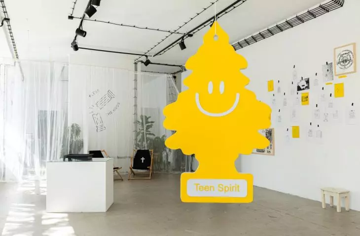
overscaled wunder-baum and deck chairs
photo: Rafał Kołsut | Traffic Design
Here we can see, among other things, a house remodeling project using garden "patents", gazebo mock-ups interpreting the concept of luxury, a scaled-down wunder-baum, deck chairs "eternal rest" and "holy rest", drawings of wickets, a bench on which visitors can engrave their inscription or a kind of credo in the form of a hand-engraved brass ruler with the inscription "always everything in sight". There are also works by invited artists interested in similar places — Sainer, Jerzy Gruchot, Jay Pop, Deepgothic, Pomeranian Service, B.trip and Houze.
A mock-up, a house remodeling project using garden "patents"
Photo: Rafał Kołsut | Traffic Design
Ola: Thank you for the interview.


