


This was supposed to be another article about design. Another in the series of stories about place branding. About a fascinating project - one of those you think about: "damn, why didn't I design this?".
I was preparing for an interview with Oleksandra Doroguntsova, the first female creative director at Ukraine's Banda(www.bandaagency.com), one of the most interesting creative agencies in Europe. I knew we were going to talk about a disaster that happened almost forty years ago. But I realized very quickly that it would also be a story about a catastrophe that happened not so long ago, almost yesterday, that is going on all the time. About the war unleashed by Putin's Russia.

The "extinction" of the logo in the following years
© BANDA agency archive
The middle of the 1980s in communist Poland. First there were rumors (including from Radio Free Europe) and disbelief. Adults, including my parents, were completely at a loss as to what to do with this information. The news barely reaching us from the West spoke of an accident or explosion at a nuclear power plant in the Soviet Union. Someone knew someone who knew someone whose aunt works at some institute where they have an apparatus that measures radioactivity. And that aunt said there was an explosion or confirmed that there was not. Depending on who relayed this "100 percent confirmed" information.

The "extinction" of the logo in subsequent years
© BANDA agency archives
A few days later, when it was absolutely impossible to hide the truth, the authorities of the People's Republic of Poland confirmed the accident at the Chernobyl power plant and ordered a campaign to administer Lugol's fluid to everyone. This was primarily about children. I don't know if it made sense, but our entire class politely marched to the health clinic to gulp the hideous-tasting suspension.
Oleksandra was three years old at the time and lived in Kyiv. She only remembers getting on a plane with her mother to escape to Moscow, where their only relatives lived.
What an irony of fate. I think we had that opportunity because my grandfather was an official. That's probably why we got the news earlier. Being a mother of a four-year-old today, I feel my mother's fear when she had to flee, having no idea if we would ever return.

logo in public space
© BANDA agency archive
It was 1986, and so Chernobyl became a "black legend" and further proof that the Soviet Union could not succeed. For me, and probably not only, it became a symbol of cruel tragedy and unimaginable losses to people and the environment, caused by the chronic inefficiency of the system. He was a warning that showed how human error could lead to powerful and irreversible consequences.
Years later, it turned out that radioactivity in the city of Pripyat could also radiate in a completely different, this time inspiring way. Three decades after those events, the now somewhat forgotten disaster and the people directly involved in the rescue operation are told in an absolutely thrilling 2019 HBO series. Emily Watson and Stellan Skarsgård, who had already starred together in Lars von Trier's "Breaking the Waves," formed a superhero duo without superhero powers, trying to prevent an even greater tragedy. While appreciating the great filmmaking, Oleksandra recalls the series as something really painful. Something that made you "feel so weak and small that you never want to watch it again."

logo in private space
© BANDA agency archives
It's not hard to guess what effect this production had on the authorities of the region where the remains of the power plant are located. It was decided that this was the best moment to also make a big splash about this real, true Chernobyl, and to show what the place looks like today. That is why Banda undertook the breakneck task of designing branding for the site.
It started with a site visit. It turned out that although they live nearby, most of the people from Banda had never been there. As Oleksandra recalls, she had been afraid of the place since she was a child. She associated it primarily with fear and having to flee in 1986. "Just like today my family has to flee from the war that Russia started," she adds.

wayfinding system
© BANDA agency archives
The trip to the Exclusion Zone proved to be a great experience for the designers. Everyone was very impressed by Chernobyl, how it looks and the emotions it evokes.
We had the impression that it was a portal to the past, where it all happened, but also to the future, where we can all find ourselves if we forget how catastrophic human error can be
- recalls Oleksandra.
Banda also met with authorities who were interested in why the most creative branding agency in Ukraine decided to visit Chernobyl. That's when the Ministry of Tourism and the Ministry of Environmental Protection and Natural Resources of Ukraine decided on the project.

wayfinding system
© BANDA agency archive
From the very beginning it was clear that this was not going to be just another branding implementation. It was impossible in this case to start with what is nice and pleasant, with tourist attractions, landmarks or "unique values" representing the place. After all, you won't find something like that around a sarcophagus over a destroyed reactor. "Disaster tourism" has reached here as well, and the Exclusion Zone has become a destination for fans from all over the world. The task the designers set themselves was to introduce Chernobyl also to those who had never even thought of visiting the place before.

series showing the stages of the disappearance of the logo
© BANDA agency archive
They focused on two issues, two "disappearances." First, the danger is gone. As Oleksandra says, today, during an hour-long airplane flight, you receive the same dose of radiation that you are exposed to if you spend 24 hours in the accessible parts of the Exclusion Zone. Secondly, the place itself is also disappearing. It's being taken over by nature, and there probably won't be much to see there in a decade. It's a kind of creepy "nuclear Venice."

flag with fading logo
© BANDA agency archives
Realizing how ambitious and important this project is, at the very beginning of the process each designer at the agency was allowed to submit a proposal. Then, after a few weeks, when the concept was ready, work began with a small team consisting of a strategist, two creative directors, two project managers and one designer. This compact team had to clash with a real decision-making staff on the government side. The client was usually represented by at least fifteen people, and at each subsequent meeting there were more; representatives of two ministries and the business sector, cultural experts, power plant employees. Summarizing a year's work on the project, Oleksandra counted that Banda prepared a total of twenty-seven presentations for her client!

flag with fading logo
© BANDA agency archives
Any branding project of this kind must engage in a dialogue with the past of the place. In some way it should position itself to history. It can discuss it, it can ignore it or immerse itself in it. But how to address the disaster? What is obvious, Banda started with it. Fortunately, they managed to make it not overwhelm the whole. Their project is not a mausoleum, it is not a monument or a tomb.

flag with fading logo
© BANDA agency archives
What makes this design unique is that it shows time and its inexorable passage as the central, most essential element of branding.
From the moment we realized that time is what we would focus on, I felt that the Chernobyl story should be a box that we are now filling with new meanings. This place is changing every day, disappearing. And while it may look familiar at first glance, inside it is different every time you look at it.
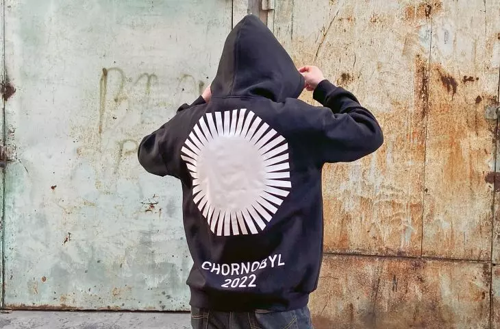
Like the sign designed by the agency , which in its conception at some point, by 2064, will simply disappear, just like Chernobyl. It's getting smaller and smaller every year.

flag with fading logo
© BANDA agency archive
A simple black logo, simple typography and an absolute lack of color are the main components of this branding.
Color has never been an option. If you stop for a moment and think of Chernobyl in yellow or green, you will feel that it is tacky and artificial. As if we were trying to hide the tragedy of the place under fancy packaging to sell it.
The graphic starting point for the sign is the shape of the fourth reactor, the place where it all began. It's a regular octagon, which, as a geometric figure, gave the designers some trouble. It created the impression that they had already seen it somewhere, and they put in a lot of work to make sure it was that shape. From there, it went easy, and Banda prepared a whole set of branding materials, from the wayfinding (spatial navigation system) concept, website, elements for social media use, to T-shirts and sweatshirts.
Immediately after the project was published, on the anniversary of the tragic catastrophe, April 26, 2021, there was a lot of buzz about it, and the reception around the world and in Ukraine was very good. Oleksandra recalls that one felt excitement and conviction that the place might finally have a future.

flag with fading logo
© BANDA agency archive
On February 24, 2022, Russia attacked Ukraine in full scale, reaching Chernobyl as well. Russian troops were stationed for more than a month in, among other places, the Red Forest, the most contaminated area around the plant, while holding its crew.
After what happened in the Exclusion Zone 2.5 years ago, I don't think anyone cares about bringing the brand back to life. Knowing how the Russian army behaved when the facility was occupied by them, it's a miracle that the disaster didn't happen again.
A few weeks after the full-scale war broke out, Oleksandra left for Slovenia, where she still lives. She felt that she had to, above all, ensure the safety of her daughter, who was not even two years old in February 2022. In her own words, time stopped for her.
I live in constant anticipation of the end of this unbelievable horror. [I have switched to "survive the day" mode, with absolutely no plans for my life.
Andrzej LERACZYK
Illustrations: archives of Banda agency.
more: A&B 1/2025 - TREE IN ARCHITECTURE,
download free e-publications of A&B