Several years ago, a small house located in the Silesian province became the property of a small family. When the number of residents expanded, the forty-square-meter building began to lack additional space - then the owners applied for help from architects from {tag:pracownie}.
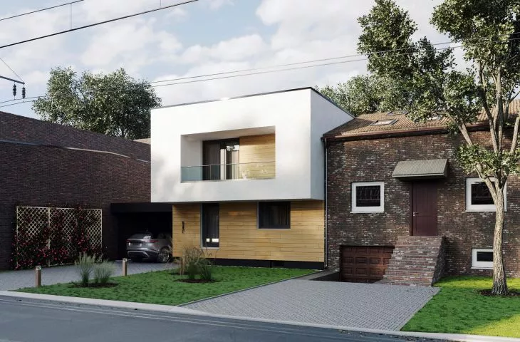
Two buildings are connected in the border of the plot - one one-story, the other a traditional two-story building with a gable roof. The one-story house with a permit for superstructure was bought by the investors' family. However, various adventures meant that the house did not "grow" in this form. In the end, lack of space meant that there was a need for more space. The investors approached the Praktyka Architektury studio, clearly defining the needs, their expectations from the new building and gently suggesting the boundary between the architects' imagination and financial possibilities.
In the border of the plot, two buildings are connected
vision: epizode-studio.com © Practice of Architecture
As the architects say about the project:
One thing was clear to all of us. No more mediocrity. Despite the many compromises that resulted from the location, the neighboring buildings, the possibility of using the sides of the world and the restrictions of the Local Development Plan, we decided to make maximum use of the resulting space and try to dress it in "something different" - unambiguously cutting off from the neighboring developments. We were very pleased when it turned out that clients also like us value individualism and are tired of the ubiquitous bland architecture of suburban neighborhoods. The next step, which we always appreciate in a development located in a border, was to consult our neighbor about our idea. This may not be legally required, but we have a natural inclination to discuss architecture and derive great pleasure from it, even when we have to talk about unwieldy solutions and are met with reluctance from our neighbors. But a conversation - especially one that is unobtrusive and devoid of dogma, a simple sketch, sometimes a 3D model can often win over the hardest heart. And mostly, in our view, all the fun is to make sure that none of the people directly affected by our work remain excluded from the complicated process that is design. Architecture is always worth talking about, even if the opponent has a completely different opinion.
© Architecture Practice
Through the superstructure, remodeling and expansion of the existing house, it was possible to achieve an unusual body of the building and a functional interior accommodating three bedrooms and a bathroom on the first floor. Thanks to the extension and cosmetic changes involving demolition or shifting of existing walls, the first floor of the building became more spacious and functionality took on a new shape.
Whenever we design, we pay attention to what we would like to achieve together with the client. Our work is all about balance. It's about the out-of-the-box solutions we can come up with to throw our weight behind giving seriousness to architecture - in a world where typical solutions are widely considered to meet all expectations - and at the same time making people rethink aesthetics. And this project gave us great scope to do so. - add the architects from Praktyka Architektury studio.
The facade is a combination of wood and off-white color
vision: epizode-studio.com © Praktyka Architektury
Dobrawa Bies: What is the shape of the building from, what were the inspirations and design assumptions?
Architecture Practice: The lump of the building undoubtedly results from the conditions of the plot, the existing neighboring buildings and the investor's assumptions. On the plot there was a one-story residential building. It did not stand out in any special way except for the fact that it stood in the border with a building twice its size. It could be said that it was squeezed between decidedly larger buildings, which in terms of aesthetics were not at the forefront of the neighboring development. While working on this particular topic, we had to keep in mind the guidelines of local law, the fact that the plot is barely eleven meters wide and that we have residential buildings on both sides, which will define how the new architecture will be "inserted" into the existing environment.
We are always inspired by the environment in which we come to design. Sometimes, we try to put our design into the context of the place. Other times, as here, the neighboring buildings do not manifest qualities that could charm us. That's when we try to create a new context, without being afraid that it doesn't have much in common with the surrounding buildings. The architecture we would like to create should tell its own story. Sometimes by reference and connection and sometimes quite the opposite - by negating the surroundings and what they represent. In this particular case, the investors turned out to be charmed by the simplicity that can be achieved with modern architecture. They asked for a simple block, with a flat roof, knowing that it would not harmonize with the neighboring building in the plot boundary or even with the neighboring building on the other side of their site. The assumptions were clear and straightforward from the start. The house is to be small, use the existing first floor as a base and be decidedly modern in its massing and function. Based on these few simple assumptions, we began work on the project.
The design challenge included the width of the plot
© Architecture Practice
Dobrawa: Building a semi-detached house is undoubtedly a design challenge, what else did you have to deal with when designing the building?
Architecture Practice: Definitely with the width of the plot. Eleven meters wide does not give much room for maneuver. We did not hide the fact that the requirement that the base of the building be an existing house also verified certain assumptions. Another element was the investor's assumption that the house should not exceed one hundred square meters, while providing all family members with basic comfort and, if necessary, a little intimacy. Designing and then building a house in a border where a building already stands on a neighboring plot is always a challenge. Already at the design stage it is necessary to anticipate difficulties and assume certain scenarios that will eliminate as many problems as possible at the stage of implementation.
When designing buildings, we always pay attention to the sides of the world and the possibility of comfortable use of the building, using the minimum contribution of modern technology to regulate the environment inside the building. Therefore, a major challenge, assuming maximum use of the floor space in relation to the restrictions that the plot and neighboring development dictated, was to design the building with ventilation in mind - we had only two elevations in which there was the possibility of placing windows, sunlight, and providing natural air circulation. There is no denying that designing this building involved many compromises, especially on the architectural side, so that the whole could "play" in a satisfactory way.
The architects relied on traditional materials
© Praktyka Architektury
Dobrawa: What materials were used and how did their selection affect the design?
Practice of Architecture: Another assumption of the investors, after all, was to rationalize construction costs. Designing on the border of the plot itself requires definitely more money. Paradoxically, existing development does not reduce construction costs at all, because moving within the existing fabric always generates them. Hence we opted for traditional solutions, the most readily available and the most widespread, so that the client has a wide range of choices of materials and contractors. The only "extravagance" is the proposal to use wood as a finish for part of the facade. Being aware that in Poland it is not particularly easy to get good quality facade wood at an affordable price, we decided to use this material mainly where it will be protected by the protruding floor elements. As a result, the wood will not be so intensively subjected to the weather and its service life will be significantly extended. Such solutions are facilitated by the extension of the first floor above the first floor outline and the canopy over the balcony. The warm wood used on the first floor and alcoves contrasts well with the broken white color that dominates the first floor of the block. The off-white color was also chosen deliberately. This is due to the nature of the environment in which the building will be located. The air of Silesian cities has long been a topic of heated discussion, and the pollutants in it are not conducive to building facades. The colors of white quickly lose their charm and aesthetically do not stand the test of time. Colors of "dirty" white such as off-white definitely go through the "aging" process better and make the facade material last much longer.
The first floor has been extended beyond the outline of the first floor
vision: episode-studio.com © Architecture Practice
Dobrawa: What requirements did the developer set for you?
Architecture Practice: In addition to those mentioned above, certainly noteworthy was the requirement that the first floor of the building still serve a residential function for most of the construction. The investors did not intend to leave their house during the extension and superstructure of the building for extended periods of time. This was a rather unusual assumption that was raised at the initial stage of project discussions. Hence the minimal design interference in the first floor of the building. Already at the beginning of the design work, we agreed with the owners that any future changes to the first floor would appear only when the building's exterior and first floor were ready. It was hard for us to accept such a solution at the beginning, but after discussions with the investors we came to the conclusion that the topic is too interesting to give up for this reason. We can only hope that customers will feel the same way after finishing the investment.
Dobrawa: Thank you for the interview!
