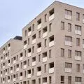
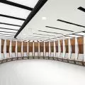
For the five-story building of the Lazienki Park Residence, located on 29 Listopada Street in Warsaw, designed by architects from the HRA Studio, Blisko prepared wayfinding - a coherent visual information system integrated with the architecture, which, like the building itself, is a contemporary interpretation of the styles of past eras.
Left: the staircase in the Lazienki Park Residence; right: the prefabricated elevator portal
Photo: Anna Nowokuńska
The visual information system proposed by the designers from Studio Near draws from the geometric reliefs and typography of the art déco style. The wayfinding concept for the Warsaw building inspired by modernist tenements of the interwar period was created at an early stage of the design of the building itself, which, as the authors emphasize, made it possible to propose signage integrated with the architecture, rather than giving only the effect of stick-on placards.
The Studio Near team designed signage for the stairwells, patio, lobby, fitness and relaxation area, underground garage and technical functions. The staircases and patio were marked with large, spacious numerals made of light-colored material resembling artificial stone, while apartment numbers, information about additional rooms and horizontal navigation signs along the corridors were made of brass.


interiors of the Lazienki Park Residence
photo: Anna Nowokuńska
The XXL scale elements are upscale in layers, while lacking color distinction. They are white on a white background. Thus, they are visible only through the shadow cast by each layer of relief, creating unusual three-dimensional effects native to art déco reliefs, the project's authors write. - The most prestigious elements mark the representative staircase. The prefabricated elevator portals with these concave sculptures of numerals are made of Corian - quartz conglomerate, an extremely durable and expensive material resembling artificial stone. The second staircase, finished with wood veneer, gained convex markings, also made of Corian, visible directly from the stair run and elevator, they add.
The prefabricated elevator portals with these concave digit sculptures were made of Corian
Photo: Anna Nowokuńska
The designation of staircases A and B in the patio space is made in the form of bas-reliefs sunk into the exterior walls. One of the most decorative elements is a geometrized sculpture indicating the bicycle room. The signs in the garage are no less stylish - in this section, the letters A and B painted on the black walls resemble the sculpted shapes of the other signs.
The 


painted on black walls, the signs in the garage resemble the sculpted shapes of other signs
Photo: Anna Novokuzinskaya
Ola Kloc: What is wayfinding?
Anna Nowokunskaya, architect and graphic designer from Studio Close: When we move around, we usually have a destination. We get to it more or less consciously, using the various clues that space gives us - because it always has some of its stagnant navigational characteristics. These were brilliantly classified in the 1950s by Kevin Lynch as: paths, edges, nodes, areas and dominants. But space - both ubiquitous and architectural - has certain limits in self-explanation, which only additional visual information will help to cross. If it is designed in a coordinated way, it creates a system. A system of visual information. This field of design also goes by many of the usual names: wayshowing/wayfinding, signage, signage or SIW. Its job is to lead us to our destination.


fitness and relaxation zone signage
Photo: Anna Novokuznetskaya
Ola: What does your design process look like?
Anna: Our process resembles that of architecture: we create a concept, supported by analyses of the architectural design, functional program or traffic scheme. Then we develop the detailed design, where we determine what the elements are made of, how high, in what colors, in what form and dimensions; we create their full content. The later phase is the preparation (files) for production and implementation. At this stage, we bring the project to its final state, which will be used by contractors using specific technologies, such as printing, painting from a stencil, engraving, milling, etc. Finally, we provide author supervision. As part of the supervision, like any other industry professional, we answer the contractors' questions, accept samples of workmanship, consult or suggest substitute solutions if the need arises. And there usually is, because there are a million variables on a construction site, and wayfinding, which is, in a way, the last part of this food chain, must respond to all changes: functional, formal, budgetary or substantive.
letter geometry
© Studio Close
Ola: What was your inspiration and starting point when designing the visual information system for the Lazienki Park Residence?
Anna: In the beginning there is always architecture. The characteristics of the space being created. The architect and his thought, his way of solving spatial issues. We try to make the idea of wayfinding design as close as possible to the idea of architecture. Perhaps even identical. It is supposed to result from it, complement it. In the case of the Lazienki Park Residence, we looked at how the HRA studio (Hermanowicz Rewski Architects) reinterprets the modernist townhouse of the interwar period and sets it in today's reality. How it appeals to the high standard of the residential development's entrance and common spaces of the time. We were drawn to this idea. We recalled the former collaboration between visual artists and architects, which resulted in a wealth of forms such as mosaic, sculpture, relief and lettering. At the time, we proposed that the visual information system should take over this function of art in architecture, so to speak.


geometric marking of the bicycle room
Photo: Anna Nowokuńska
We reached for the art déco style prevailing at the time and also subjected it to a contemporary interpretation. We designed the most important elements of the signage, such as floor numbering, as sculptures, layered and stepped, recessed in the walls or protruding from them. With geometric lettering, we entered into a dialogue with art déco. Similarly, with the insanely geometric layered sculpture of a cyclist, indicating the function of the bicycle room. With these treatments we moved the tectonics of the walls. The spatial elements further introduced shadows. It is the play of light and de facto shadows that allows us to see these sculptures, which are intentionally not distinguished by color, and sometimes even material. It is white on white. The spatiality of the elements and their content is only revealed to us by the shadows cast by each individual layer.
bicycle signage
© Studio Close
Ola: What was the biggest challenge in this project, and what are you most pleased with?
Anna: It's a classic challenge to convince an investor for such individualized - and therefore more expensive - spatial solutions. Nevertheless, in the case of the Lazienki Park Residence, the investor, Yareal Polska, was sympathetic to our signage concept from the beginning, and we incorporated the wayfinding project practically without compromising the original idea.
{Image@url=https://cdn.architekturaibiznes.pl/upload/galerie/43464/images/original/cdeceb0af6a44f519c958f43f467f169.jpg,alt=oznaczenie of cage B,title=wayfinding signage of cage B}
external marking of cage B
Photo: Anna Novokuznetskaya
Another standard challenge is the struggle against time.... Such significant changes in the interiors caused by wayfinding (such as the sculptures recessed in the elevator portals) are only possible until some point in the project. It is therefore crucial for the SIW designers to cooperate with the architect before the detailed design phase, possibly the detailed interior design phase, is completed. Otherwise, we are doomed to the effect of wayfinding as a tacked-on "plaque" and will no longer use the full potential of signage seamlessly integrated into the architecture. At the Lazienki Park Residence, it is these integrated spatial elements that we are most pleased with, especially since they were incredibly carefully crafted. They were prefabricated together with the elevator portals, made of Corian - a quartz conglomerate, characterized by high strength and the possibility of great precision in detailing. They are the beating heart of the project. It was the whole balance of forces - a convinced investor and architect, us in the role of the SIW designer as an industry specialist at an early enough stage, an experienced General Contractor (PB Unimax) and a careful signage subcontractor (MasterGraf) - that resulted in a realization we are really proud of.
Ola: Thank you for the interview!


