Architectural education and clients' increasing awareness of architectural history means that developers are increasingly willing to go beyond the standard stock of features with which they describe their buildings in promotional materials. It's no longer just greenery and coziness, but also references to modernism and Le Corbusier. Most of these, however, are marketing newspeak, ridiculing the investments and their designers.
Housing units in Marseille and Berlin
photo: jpmm / flickr.com, Gunnar Klack / Wikimedia Commons
The modernist movement set itself the goal of developing a new model of architecture and urban environment to suit the new 20th-century society. Architecture was given ambitious tasks (sometimes over-the-top) - to cure tuberculosis, to hygienize crowded industrial cities, to create equal housing conditions for different social groups or, finally, to resolve the housing crisis. Some of these ideas directly influenced the aesthetics of modernism - flat roofs were meant for recreation, ribbon windows for optimal light, foundation on pillars to free up the first floor for shared functions.
shell
Nu! Wola
photo: investor press materials
Today's architects reach for these solutions mainly motivated by the desire to achieve a specific aesthetic effect. This is because it is difficult to find in developer architecture a social program, which is the essence of modernist multifamily construction (villas were governed by their own rules, of course). The promotion of modernist architecture and the entry of its aesthetics into the mainstream allows, on the one hand, the protection of modern cultural assets, but on the other hand, it is used to build a narrative by those involved in selling investments, but also by the architects themselves.
From a green oasis to an apartment machine
Nu! Wola
photo: investor press materials
However, when writing about references to masters of style, architects often fall into a trap, and descriptions of investments become an object of derision. They arouse no less controversy than the descriptions of green corners and forest glades that have been overused for years, which allegedly reflect the spirit of Polish real estate developers.
le Corbusier in Wola
Nu! Wola
photo: investor press materials
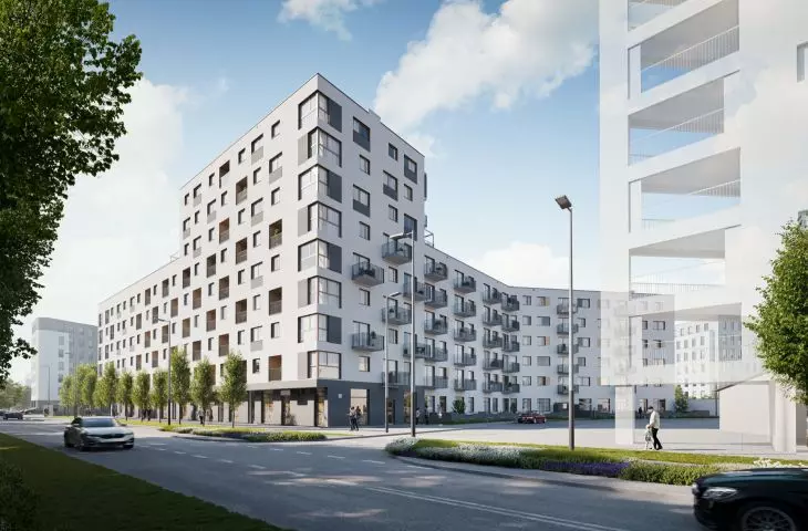
Sponsored articles and reprints from developers' press materials about two developments in Warsaw's Wola have recently flooded industry and local portals. The first "modernist" development is the Nu! estate located on Kolejowa Street. The blocks of flats being erected by Skanska will replace the industrial buildings in the area, the main feature of which is the complicated urban layout resulting from its former warehouse function. Unfortunately, secondary subdivisions of plots of land cement this layout, ruling out the chances for the formation of a logical grid of streets and sequences of public space here.
five blank spots
Nu! Wola
photo. press materials of the investor
Kuryłowicz & Associates studio is responsible for the estate's design, and as the investor himself writes - it assumes high attention to detail and elegance. The buildings are to be barrier-free, and the estate will include a small park (or rather, a square) with a brine graduation tower. However, the mockery of Internet users was aroused by the designers' statements distributed with the press releases.
The idea for the design of the NU! Warszawa Wola assumed the use of numerous inspirations from pre-war modernism - we created a concept referring to Le Corbusier's famous five principles of design. A long façade consisting of thirteen irregularly spaced window risers will give the building's massing a sculptural effect and allow it to blend in with the diverse and fragmented development of its surroundings.
Piotr Wilbik of Kurylowicz & Associates studio.
Looking at the visualizations of the estate, which looks like a completely average contemporary development, which could be built either in the center of Warsaw or in the suburbs of Kielce, it is difficult to find the fulfillment of even one of the pope's five principles of modernism.
-construction of the house on free-standing pillars (fr. pilotis)
-free plan, which solves the paralysis of the structural partition
-free facade that has been freed from load-bearing function
-horizontal ribbon windows that allow more light than those in the load-bearing walls
-garden on the flat roof
It's hard to say where the architects have applied Le Corbusier's precepts, so for now a large amount of skepticism remains in anticipation of the next stages of the development. What is seemingly not visible in the visualizations, that is, the free plan, is easily verified by looking at the projections of the offered apartments. One will not find a modernist free plan, but rather a collection of standard products offered widely on the market today and tailored to the financial capabilities of investors and residents.
big-city rentals
Chronos
photo: investor press materials
A similar narrative filled with platitudes about modernism was employed by a developer with a name that is not surprising in this context - Moderna. Located at the busy intersection of Solidarności Avenue and Zelazna Street, the "Chronos" building is to be covered with a stone facade "more durable than time." While not relenting in the effort to understand this phrase, it is worth delving into the description of the timeless style of the building, designed by S.A.M.I Architects. The elegant edifice is to be characterized by a timeless style, which in a modern but subdued way refers to the style of old townhouses.
The most important goal of the designers was to create an elegant creation. In a sophisticated, ever-present, dignified and representative form of modernist functionalism. It is harmony without exuberant ornamentation and stylistic gallantry.
description from the investor's website
millions of years of experience
Chronos
photo. investor's press materials
As the developer announces, the glazing of the block is to attract the eye and arouse appreciation at the first glance of any passer-by. The spirit of luxury is to be given by the use of natural materials - stone and wood. The stone is dated by the developer to be 145 million years old, indicating the durability and timelessness of this project. Such luxurious finishing, however, is a feature of only the front facade. The back of the building will be much more modest, largely plastered.
Chronos
photo: investor's press materials
But will the building really look as the developer describes it and drip with the modernist luxury of big-city townhouses? The investor himself doesn't seem to believe it.
The visualizations and any graphic presentations posted on the site are for illustrative purposes only and do not constitute assurances about the properties of the subjects of the visualizations and/or presentations. The internal and external appearance of the building, landscaping and individual units are subject to change during and after the investment process.
description from the investor's side
Chronos
photo: investor's press materials


