


GLOBALO, a leader in the production of high-quality cooker hoods, has undergone a rebranding process that further accentuates the philosophy that has always accompanied the brand - Home Harmony. This idea, focused on harmony as a key element of everyday life, has been the foundation of GLOBALO's operations for years. The rebranding reflects the brand's desire to further emphasize the balance between aesthetics, functionality and tranquility in the home space.

GLOBALO brand rebranding - emphasizing the Home Harmony philosophy
© GLOBALO
This approach is inspired by the Fibonacci sequence, which reflects perfect proportions and natural beauty. These mathematical principles found their way into the design of the brand's new visual identity elements, combining art and science in a harmonious way.
Logo inspired by the golden division and Fibonacci sequence
The refreshed GLOBALO logo, designed based on the principles of the golden division, is a symbol of harmony, proportion and attention to detail. The golden division, present in nature, art and architecture, combined with the Fibonacci sequence, gives the design aesthetic perfection. These mathematical proportions intuitively draw the eye, bringing a sense of balance and calm.
The geometric sigil of the new logo refers to flowers of life - a symbol of unity and infinite potential. The round shapes and harmony of the lines allude to both the brand's global reach and its philosophy based on building lasting relationships with customers and partners.

Logo inspired by the golden division and Fibonacci sequence
© GLOBALO
Signet of the table - a symbol of family life
The new logo features the sigil of the table, which is the heart of home life. The table is the place where daily conversations take place, bonds are built and moments of closeness are shared. The arrangement of circles symbolizing chairs around the table reflects the togetherness and balance that are at the heart of Home Harmony's philosophy. The geometric design of the sigil, based on the Fibonacci sequence, further reinforces the sense of proportion and coherence central to the GLOBALO brand.

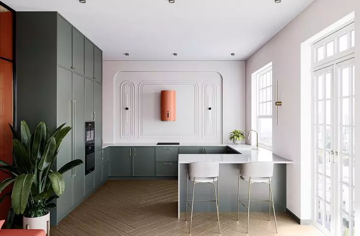
Callia Isola 39.1 Cashmere
© GLOBALO
Harmony collection - the essence of harmony and nature
GLOBALO's rebranding is reflected in the Harmony collection of hoods. This is a series of products that combine innovation with inspiration drawn from nature. Kitchen hoods from the new collection are available in subtle, natural shades: brick, sage, ivory and cashmere. This harmonious color palette fits perfectly into modern and cozy interiors, emphasizing the warmth and tranquility of the home space.

Callia Isola 39.1 Ivory
© GLOBALO
Rebranding in line with brand values
The new GLOBALO logo, inspired by the golden division, is not only a graphic symbol, but also an expression of the brand's values - attention to detail, respect for proportion and the ability to combine aesthetics with functionality. It is a visual reflection of the Home Harmony philosophy, which permeates every aspect of GLOBALO's business - from products to communication to customer relations.

Miraya 39 Brick
© GLOBALO
GLOBALO's rebranding is an invitation to discover a kitchen where harmony becomes the heart of the home. The new hoods in brick, sage, ivory and cashmere hues will bring balance, beauty and inspiration to interiors. Together with GLOBALO, create a space that perfectly reflects your needs and lifestyle.

Miraya 39 Ivory
© GLOBALO
For more information, visit the company's {tag:Manufacturer} page on the A&B portal.