Designing in a difficult space requires interior designers to be extremely flexible and ready for change. How did Piotr Lucyan of Art "Up Interiors deal with an attic apartment?
The dominant feature in this space is a mix of old and new
Photo by Mateusz Kowalik, © Art'Up Interiors
The apartment is located in a post-war reconstructed tenement in Warsaw's Old Town. It's a space full of slants and difficult to adapt spaces. How did the designer deal with it?
The challenges? There were several, primarily the slants. In a space of seventy square meters additionally limited by bevels, solutions were needed to maximize functionality. We prepared as many as seven versions of the room layout," says Piotr Lucyan of Art "Up Interiors studio.
Adjusting to the bevels was the biggest challenge of this arrangement
fot.Mateusz Kowalik, © Art'Up Interiors
maintain the character of the place
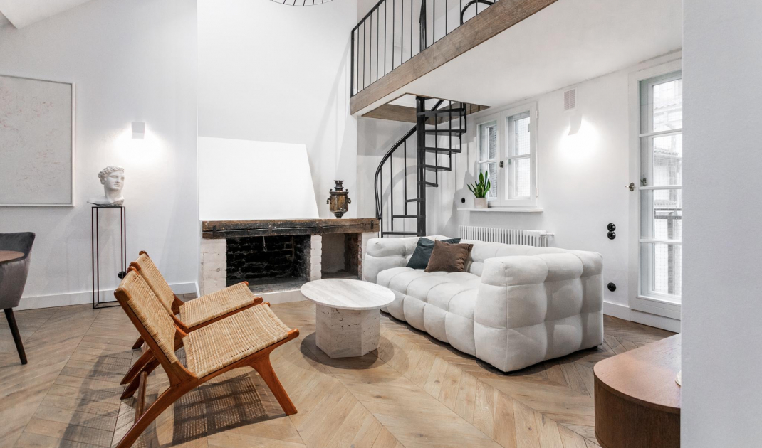
The investor's main goal was to preserve historic elements, such as the historic fireplace. Equally important was to preserve the original wooden floor, which bore traces of the attic's previous function - an art studio. Unfortunately, it was replaced with modern oak plank flooring, which refers to the historic design. On the walls it was decided to use white plaster.
How did the layout of the rooms in the apartment change? Slightly. The visible kitchen was turned into a bath room with a free-standing bathtub. Eclectic furniture was found here - some of it is antiques, some is brand new. The former bathroom was converted into a modern dressing room. A mezzanine floor was also added in the living room area - which creates a new space.
The apartment is a real art gallery
photo.Mateusz Kowalik, © Art'Up Interiors
style and character
How can you define this interior? Minimalism combined with modern elements. Inside you will find everything. Nineteenth century samovar, communist accessories, unique applied art and more. The peculiar mix of styles is a delicate blend of old and new in the right proportions.
We worked with a dilapidated and neglected space, into which we breathed new life. We managed to create an interior that is not obvious, gracefully combining history, art and modern design. I'm glad that the contemporary elements we added fit harmoniously into this historic location. The historic feature of the place takes on a new character," concludes Piotr Lucyan.
The bedroom is set in orange and gray
fot.Mateusz Kowalik, © Art'Up Interiors


